The mixing and editing work on the debut album from D.C.-based Norteño band Los Ilegales de Lempira is winding down, and the band has asked me to put together the graphic design for the album as well. Here’s a look into that process as our recording studio was converted into a very different kind of studio for the weekend!
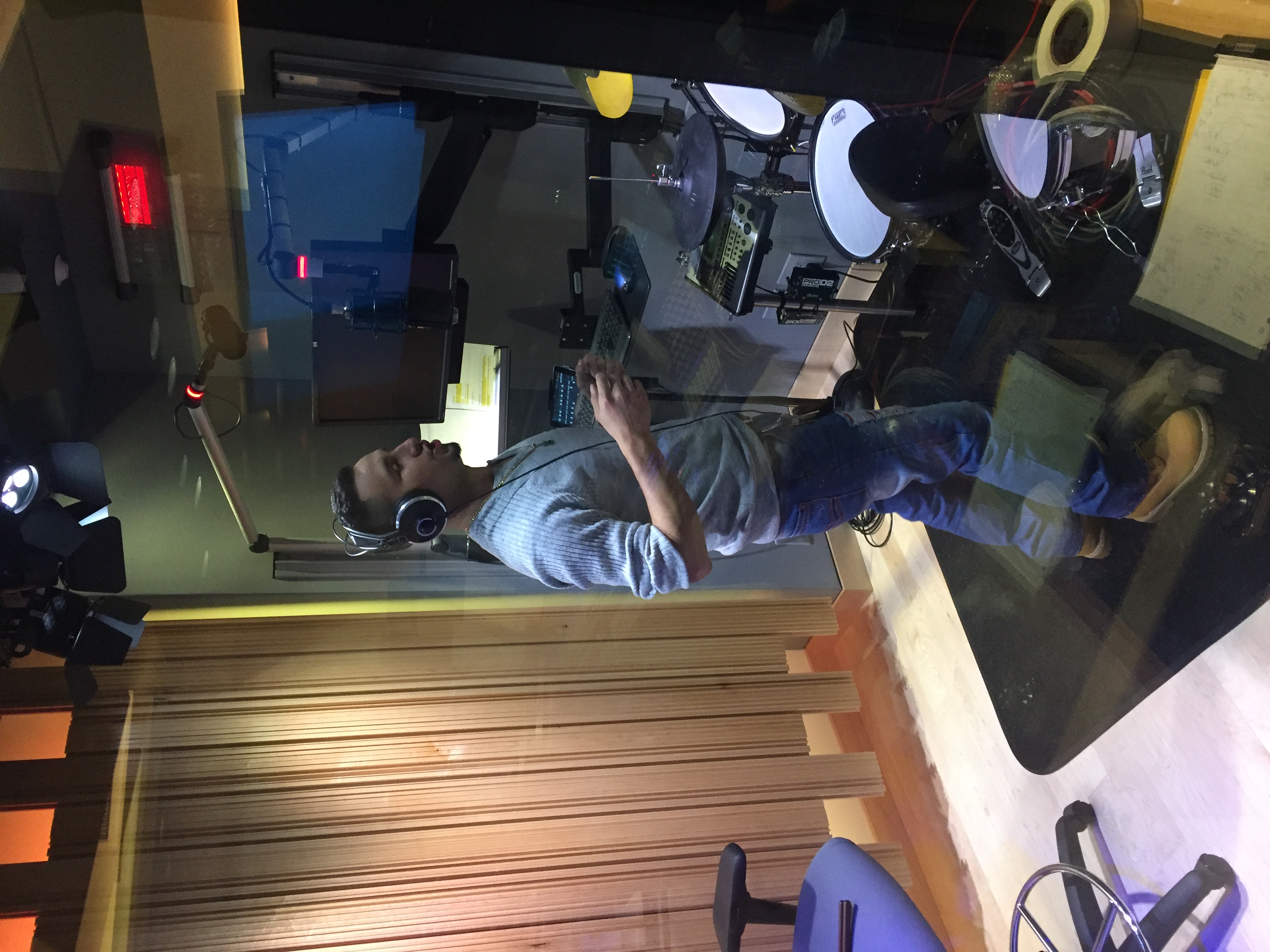
A couple of the guys from Los Ilegales de Lempira were back in mid-November to do a couple more pickups. As much as you try to avoid it, it seems inevitable in any recording project that there will be a couple of last-minute tweaks that need to be made before you can really call it “done”.
Following that, we scheduled another studio session with the guys, but this time, it was a photo session.
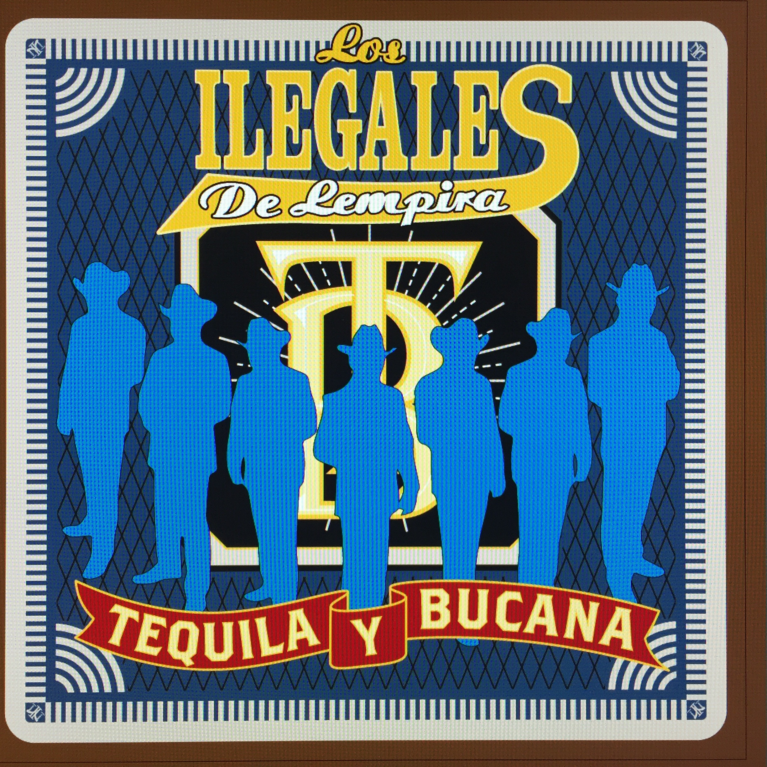
The Norteño genre has a very specific sort of flavor to it — in the music, obviously, but also in the way the bands dress and the types of graphics you see on the CD covers. So the band has asked me to put together a graphics package for them that looks like a Norteño CD, but also showcases the band and their unique style. They gave me a couple of CDs of some of their favorite bands that I have been using to come up with some ideas of how we’re going to present their material.
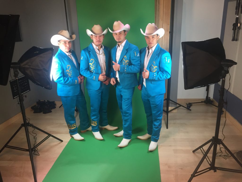
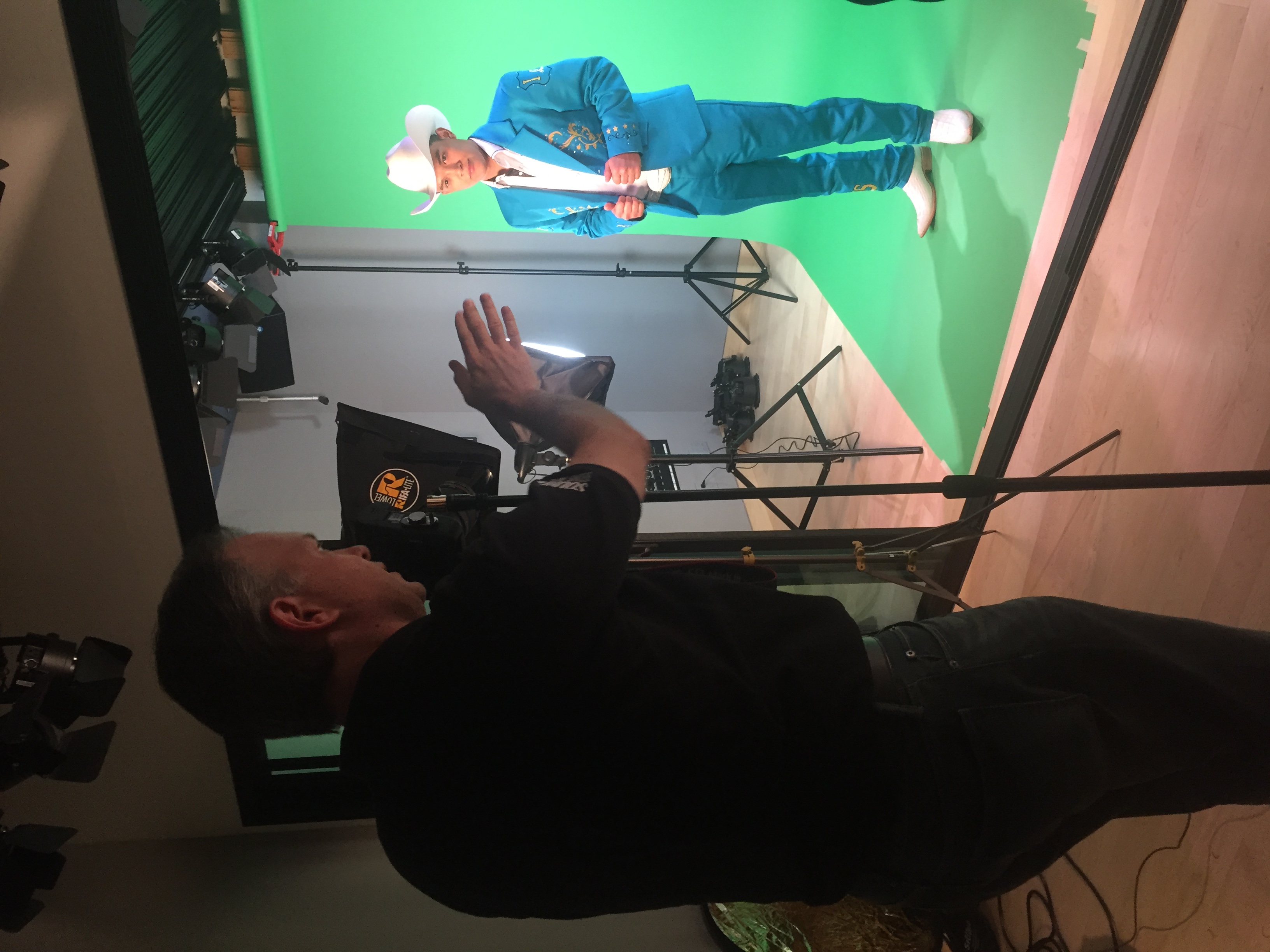
The band wears matching blue embroidered suits and jackets on stage, with white boots and hats. So they’ve got a great, eye-popping look that photographs very well. We talked briefly about going out somewhere for a photo shoot, but from the kinds of covers they’re trying to imitate, it made more sense to photograph them individually in front of a green screen. That gives us much more flexibility about choosing the best shot of each member, and putting them in exactly the ambience we’re going for in the final product.
This is the first time we’ve shot green screen here, and I wanted to make sure the rig was going to work correctly before the group got here on Saturday. So late last week, I had Ann put on a light blue blouse, similar in color to the band’s outfits, and did some test shots.
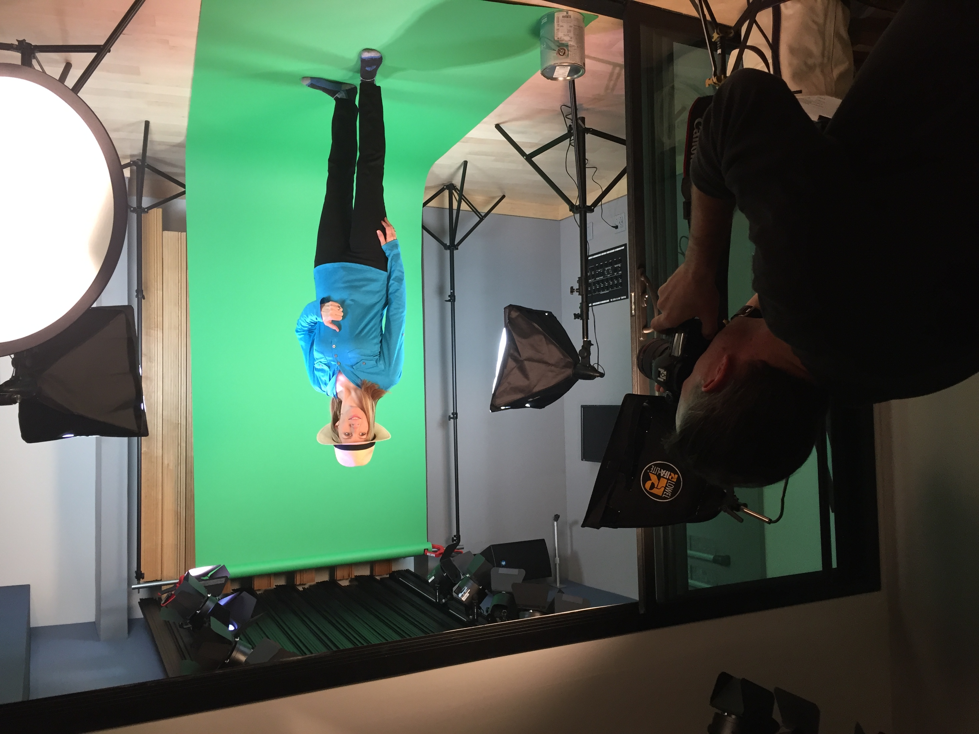
I think the biggest takeaway from the test session was how tricky this particular color blue is to shoot against a green screen! Green screen photography uses a process known as chromakeying where the computer detects a particular shade in the raw photo, usually green, and subtracts it from the image. As long as the subject isn’t wearing anything bright green that closely resembles the background, the process works pretty well and doesn’t need a ton of cleanup.
But this particular blue has some green in it. A lot of green, in fact, and these guys are wearing full suits in that color. So I will need to be very careful with my adjustments or the computer will take them completely out of the picture, leaving only the subject’s boots, hands, face, and hat. Maybe that’s useful if they ever do a follow-up album called The Invisible Men, but not helpful in this instance.
I’ve had a number of conversations with Misael over the past couple of weeks about ideas for the album cover. Since Norteño music has a strong rural, western flavor to it, and the title track of the album extols two of the band’s favorite beverages, Patron Tequila and Buchanan’s Whiskey (aka “Bucana”), my suggestion was a pair of playing cards, one showing a bottle of tequila and the other a bottle of whiskey. But since Norteño CDs always have pictures of all the band members on the cover, the playing card shape wasn’t going to work as well as I would have liked. So I tweaked the shape a little bit and made it a square, rather than a rectangular playing card. The end result is a little more like a beer coaster, which fits very nicely with the overall theme.
So in preparation for the photo shoot, I put together a dummy cover graphic so we could figure out where everyone would be in the final picture.
With that figured out, the band came in this past weekend and each took a turn on the “green carpet.”
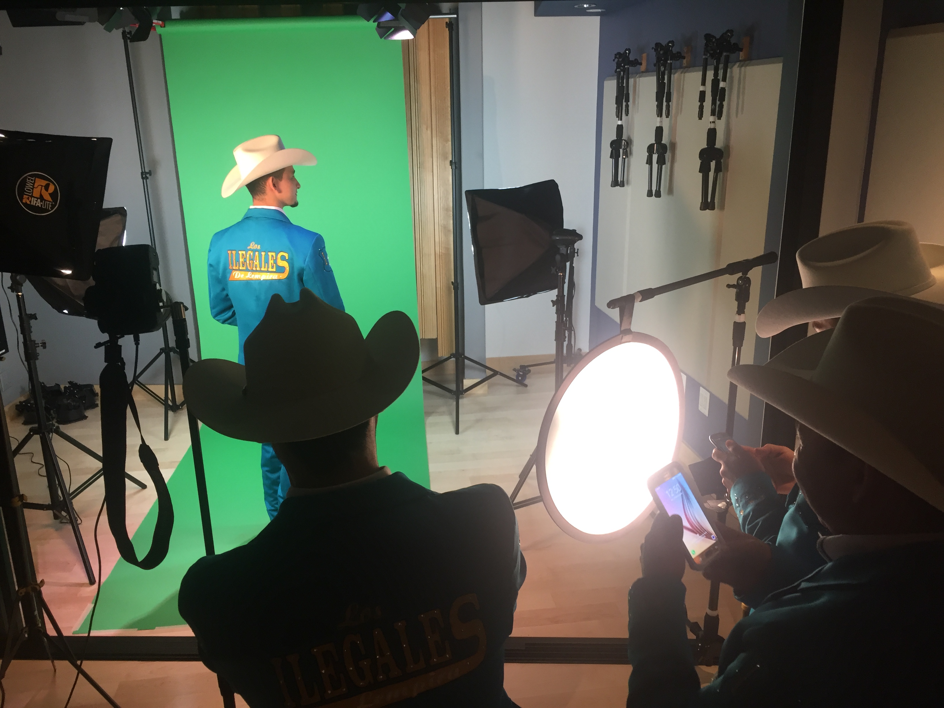
All the shots came out very well and I’m very happy with them. Next up is to spend a little time going through the 200 or so shots we took and choosing the best ones. I’ll probably process a couple of photos of each guy in the various poses we did, and give the band whatever shots we don’t wind up using on the cover so they have some pictures they can use for other promotional stuff they happen to be doing.